Monday, June 11, 2007
Sartorial Slam: Atlanta Thrashers
by Greg
 In their short history, the Thrashers have already established a borderline schizophrenic sense of design -- three different jersey styles, none having much to do with the others.
They removed one from the mix this past season -- the dark jersey with the much-maligned stylized "T" on the front. The replacement was, in my eyes, a step back -- the only improvement was using the primary bird logo, which I like. It's got a bunch of things that could be cool -- asymmetry, "ATLANTA" down the sleeve -- but that somehow don't work. And the powder blue is bad, bad, bad -- and then exacerbated by more (dark) blue on the shoulders and arms.
(That said, the powder blue is easily the most popular jersey at home games, so it's not like anyone's taking my fashion advice.)
For my money, the best design is the whitehome road jersey -- clean, good logo. I could do without the silly zig-zags on the sleeves, and I don't like the design (bird tracks?) running around the waist. But it's the best of the lot.
I convened a panel of experts to discuss these jerseys -- Brushback of Sidearm Delivery, who actually has a doctorate in bad jerseys, and Jes, who runs this here blog, and came up with this idea in the first place. Brushback first:
Atlanta's jerseys have never really made a strong impression on me, one way or another. I like the "Atlanta" down the sleeve, though I don't like that it's only on one side. I'm not into any of the colors the Thrashers have used, especially powder-blue, but they haven't been awful, either. I even kinda like the logos the team has used, even though they're generic and stupid (a bird holding a stick, some kind of "T" thing) and the jerseys themselves are a bit too "busy"-looking.
The opposition to that shade of blue was universal -- I give you Jes:
The Thrashers uniforms are a lot like the team on the ice: Flashy, busy, but not quite good enough.
They have a pretty good main logo and nice colours (although the baby blue is inexcusable and does not work on a hockey sweater), but way too much frilly stuff going on. If they stuck to a more basic design, they could have some killer unis. If their hockey team also stuck to the basics more often (hard work and defense), they'd likely win more games.
Jes also came out against the Thrashers bird -- The Star Trek geek in me loves the Romulan Bird of Prey they have going on, but I'm not sure what they were trying to do -- but I have to come out in opposition here. It's a little angular and silly, but overall, considering some of the damage other teams have done to animals...

...all things considered, I think they just did fine.
 In their short history, the Thrashers have already established a borderline schizophrenic sense of design -- three different jersey styles, none having much to do with the others.
They removed one from the mix this past season -- the dark jersey with the much-maligned stylized "T" on the front. The replacement was, in my eyes, a step back -- the only improvement was using the primary bird logo, which I like. It's got a bunch of things that could be cool -- asymmetry, "ATLANTA" down the sleeve -- but that somehow don't work. And the powder blue is bad, bad, bad -- and then exacerbated by more (dark) blue on the shoulders and arms.
(That said, the powder blue is easily the most popular jersey at home games, so it's not like anyone's taking my fashion advice.)
For my money, the best design is the white
I convened a panel of experts to discuss these jerseys -- Brushback of Sidearm Delivery, who actually has a doctorate in bad jerseys, and Jes, who runs this here blog, and came up with this idea in the first place. Brushback first:
Atlanta's jerseys have never really made a strong impression on me, one way or another. I like the "Atlanta" down the sleeve, though I don't like that it's only on one side. I'm not into any of the colors the Thrashers have used, especially powder-blue, but they haven't been awful, either. I even kinda like the logos the team has used, even though they're generic and stupid (a bird holding a stick, some kind of "T" thing) and the jerseys themselves are a bit too "busy"-looking.
The opposition to that shade of blue was universal -- I give you Jes:
The Thrashers uniforms are a lot like the team on the ice: Flashy, busy, but not quite good enough.
They have a pretty good main logo and nice colours (although the baby blue is inexcusable and does not work on a hockey sweater), but way too much frilly stuff going on. If they stuck to a more basic design, they could have some killer unis. If their hockey team also stuck to the basics more often (hard work and defense), they'd likely win more games.
Jes also came out against the Thrashers bird -- The Star Trek geek in me loves the Romulan Bird of Prey they have going on, but I'm not sure what they were trying to do -- but I have to come out in opposition here. It's a little angular and silly, but overall, considering some of the damage other teams have done to animals...

...all things considered, I think they just did fine.
Labels: Sartorial Slam, thrashers
Comments:
<< Home
Here's what I said in October of 2005, regarding the Thrashers sweaters:
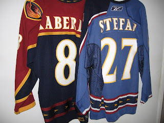
For the record, I also hate Altanta's third sweater (left), and their normal home sweater (right). The blue on the third jersey is not even a color that's really in their scheme. Like the Philadelphia Eagles' or Duke Blue Devils third jerseys which are black despite the fact that neither one of those teams has black as one of its colors, the Thrashers third sweater is Carolina Blue¹, which isn't one of theirs. I think it's goofy that they only have the number on one shoulder of the third sweater and "ATLANTA" down the sleeve from the other shoulder, but there's nothing in the rulebook dictating that the numbers be on the shoulder at all.
As far as the normal home jersey goes, it also vaguely resembles the female reproductive system.
More here

If you look at the bird on the left shoulder of Frankie Kaberle's old uni, it is supposed to be a parody of the Warner Brothers' shield (T-W were the original owners)...
# posted by  : 1:04 pm
: 1:04 pm
Check it out-- when you click on the jersey photo, it gets frickin' HUGE. That's some awesome detail!
The only reason I can't stand Atlanta's third jersey is because of that stupid "Blueland" ad campaign. But, scarily enough, when one finds out that the said third is the bestseller, such a campaign makes sense...
Check it out-- when you click on the jersey photo, it gets frickin' HUGE. That's some awesome detail!
Yeah, someone was a little too lazy to reduce the photo size. Whoops!
Yeah, someone was a little too lazy to reduce the photo size. Whoops!
Not to pimp my own blog, but I do have a point to make. The ATLANTA down the sleeve is a nice idea, but the color scheme just doesn't work for it. Want to see one that does? Look at my Bakersfield Condors jersey. It works well, and I think it would work better for the dark jersey (home? away? who can tell these days?). I love wearing that Bakersfield jersey. It's so different.
# posted by : 7:06 pm
: 7:06 pm
How could you NOT like the Blue sweaters? Philistines! Who else has the balls to have light blue, The sky in which the birds fly!?
Post a Comment
# posted by : 8:23 am
: 8:23 am << Home
![]()