Wednesday, May 30, 2007
Sartorial Slam: Anaheim Ducks
(This is the first in a mini-series analyzing team uniforms, logos, colours, and other fashion items.)
The Anaheim Ducks underwent a radical facelift this off-season, which is how we do things in the OC, bitch!
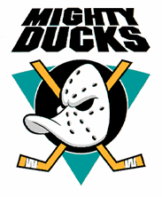
Gone was the 'Mighty' from their name. Gone was the duck-mask logo and teal/purple uniforms. Gone was the backwards nature of their name (Mighty Ducks of Anaheim). Gone was the Disney ownership and constant reminder that the team was named after a horrible movie.
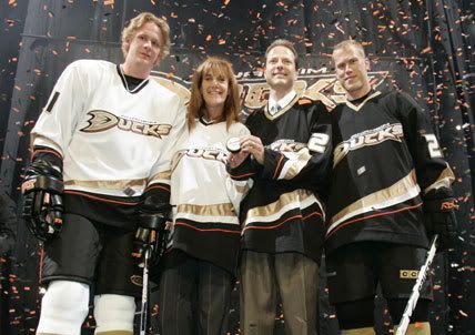
Today's Ducks have a sleeker, cleaner, and modern look to them. While the old uniforms stood out (good or bad, depending on your point of view), the new uniforms don't leave much room for one to look at them with utter disgust.
In going to their new logo and uniform, its as if the Ducks were ashamed of their past and their nickname. Do you notice that there is no actual duck in their logo? Without completely changing the name, the Ducks have become a whole new team with very little 'duck' to them.
The uniforms? They are clean, but also tremendous bland and boring. The colouring, font, and style are uninspired and don't give the Ducks much of a unique look. The Ducks were so afraid of looking bad that they went 180 degrees in the opposite direction to appeal to the LA-Anaheim crowd. It's as if they took the easy way out.
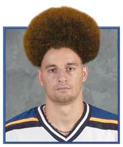
How does a Ducks fan see the change? Well, I asked Earl Sleek from Battle of California, a noted Patrick Swayne Fan and Microsoft Paint Extraordinaire, for his thoughts:
My blogging partner Greg, to my surprise, presented a contrary view:
Overall, the Ducks went from wild and gaudy to clean and boring. Given how the Ducks play the trap and play a very "Canadian" crash and bang game, perhaps the new uniforms are reflective of their very cold and brutal personality.
The Anaheim Ducks underwent a radical facelift this off-season, which is how we do things in the OC, bitch!
Gone was the 'Mighty' from their name. Gone was the duck-mask logo and teal/purple uniforms. Gone was the backwards nature of their name (Mighty Ducks of Anaheim). Gone was the Disney ownership and constant reminder that the team was named after a horrible movie.
Today's Ducks have a sleeker, cleaner, and modern look to them. While the old uniforms stood out (good or bad, depending on your point of view), the new uniforms don't leave much room for one to look at them with utter disgust.
In going to their new logo and uniform, its as if the Ducks were ashamed of their past and their nickname. Do you notice that there is no actual duck in their logo? Without completely changing the name, the Ducks have become a whole new team with very little 'duck' to them.
The uniforms? They are clean, but also tremendous bland and boring. The colouring, font, and style are uninspired and don't give the Ducks much of a unique look. The Ducks were so afraid of looking bad that they went 180 degrees in the opposite direction to appeal to the LA-Anaheim crowd. It's as if they took the easy way out.
How does a Ducks fan see the change? Well, I asked Earl Sleek from Battle of California, a noted Patrick Swayne Fan and Microsoft Paint Extraordinaire, for his thoughts:
I hate our new logos, not so much the actual design itself, but I hate that we were pressured to change. I hate the timidness and the cowardice and the resulting blandness of the whole process.
The Disney Duck wasn't demeaning (to me, at least). It had nothing to do with the movie any more--this was a forged identity by players on the ice. Mighty Ducks were an NHL team, and shame on you if you still mocked the logo; that just means it will hurt a lot more later when they eliminate your team.
Anyway, as for the "design" there's nothing terrible about it, but it is awfully bland. It's one step above putting the team name in COURIER font or something. Pretty much I assume this is from the same desire not to be offensive to league purists, but there's not even really a logo.
My blogging partner Greg, to my surprise, presented a contrary view:
I like them. I think -- along with the Wild's third jerseys -- they represent a slightly more traditional outlook, without just aping old school fashions. It's the pendulum traveling the other way after the sins of the '90s (the first Ducks uniform, the Lightning, the Sharks, the Stars uterus, the Bruins and Predators alternates) -- realizing that restrained does not mean boring.
It's not my favorite uniform, but it doesn't make me wince. There's a lot of good things going on with the Ducks.
Overall, the Ducks went from wild and gaudy to clean and boring. Given how the Ducks play the trap and play a very "Canadian" crash and bang game, perhaps the new uniforms are reflective of their very cold and brutal personality.
Labels: ducks, Sartorial Slam, uniforms
Comments:
<< Home
Flying saucer/melting frizbee? Nobody has said "boo" about the new logo compared to the howls of outrage (and millions of merch sales) surrounding the Buffaslug.
# posted by  : 9:02 am
: 9:02 am
I kinda agree with Greg- the Ducks new unis almost atone for past sins.
"First of a series"? Looking forward to the rest!
(And, the idea with sticking an image at the bottom of the comments-- I think I'm gonna steal that...)
"First of a series"? Looking forward to the rest!
(And, the idea with sticking an image at the bottom of the comments-- I think I'm gonna steal that...)

That's because the Buffaslug is hideous.
I agree with Greg and disagree vehemently that the movies (any of the trilogy) sucked. Jes, shame on you for demeaning Emilio Estevez's career-defining oeuvre.
I agree with Greg and disagree vehemently that the movies (any of the trilogy) sucked. Jes, shame on you for demeaning Emilio Estevez's career-defining oeuvre.
I, too, must come to the defense of the Mighty Ducks movies. Well, at least the first one. Any movie with a cameo by the future Mr. Willa Ford has to be a cinematic masterpiece.
Admit it!
Oh, but I'm no fan of the new Ducks digs. Couldn't be more boring, if you asked me.
Admit it!
Oh, but I'm no fan of the new Ducks digs. Couldn't be more boring, if you asked me.
I actually think "Anaheim Ducks" (or better, "Ducks of Anaheim") is a pretty great name, aesthetically speaking. It rolls right off the tongue, and is much better without the "Mighty".
But you're right about the new uniforms. They seem half-finished to me. The "D" in "DUCKS" seems vaguely like a webbed duck foot, but aside from that there is very little duckishness about these unis.
Should we expect to see a third jersey next season?
But you're right about the new uniforms. They seem half-finished to me. The "D" in "DUCKS" seems vaguely like a webbed duck foot, but aside from that there is very little duckishness about these unis.
Should we expect to see a third jersey next season?
I'm not sure how I feel about them. On one hand, I like how they have a tradition look, and they do look somewhat "sleek". I like these colors a lot more over the other ones.
I don't like the lack of a logo, though. It comes off as too boring, and they could come up with something with at least some resemblance to an actual logo, instead of the fancy "D".
I don't like the lack of a logo, though. It comes off as too boring, and they could come up with something with at least some resemblance to an actual logo, instead of the fancy "D".
# posted by : 9:22 am
: 9:22 am
Well, shit, there goes one of my summer blog ideas. Bastard.
I don't like that the Ducks are using their wordmark as their logo. Even if you just put that webbed "D" on the front of their jerseys it would feel a little more "right." That being said, I've gotten kind of used to it, and compared to a lot of other abortions of hockey jerseys floating around in the NHL still, it's pretty okay.
My problem with the previous jerseys was the combination of the colours, the diagonal striping (never works on a hockey jersey -- NEVER), and the fact that until their final attempt, their third jerseys were flat-out terrible. The first one, with Wild Wing, should've gone by way of the Blues' garish trumpet unis, the second probably should've worked but the colours were just atrocious, but the third was classy, and I think is sort of what they were going for this time. The third third jersey (heh) looked like a cross between an old-school hockey sweater and a baseball shirt, and it really worked well, even if the colour didn't match the rest of the equipment.
So, who's next? Atlanta? Home of the weird shade of blue and lopsided home jerseys?
Post a Comment
I don't like that the Ducks are using their wordmark as their logo. Even if you just put that webbed "D" on the front of their jerseys it would feel a little more "right." That being said, I've gotten kind of used to it, and compared to a lot of other abortions of hockey jerseys floating around in the NHL still, it's pretty okay.
My problem with the previous jerseys was the combination of the colours, the diagonal striping (never works on a hockey jersey -- NEVER), and the fact that until their final attempt, their third jerseys were flat-out terrible. The first one, with Wild Wing, should've gone by way of the Blues' garish trumpet unis, the second probably should've worked but the colours were just atrocious, but the third was classy, and I think is sort of what they were going for this time. The third third jersey (heh) looked like a cross between an old-school hockey sweater and a baseball shirt, and it really worked well, even if the colour didn't match the rest of the equipment.
So, who's next? Atlanta? Home of the weird shade of blue and lopsided home jerseys?
<< Home
![]()