Sunday, December 03, 2006
NHL Continues Destruction of Tradition
Here is the pictured concept design for the new 'streamlined' uniforms for the Boston Bruins.
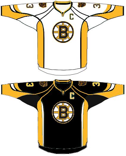
Yea or Nay? I'm going with a big NAY! Why must they mess with Original Six teams? I know the Bruins have modified their designs, but the basic uniform always remained classy and crisp (The Cheerios Bear was a marketing tactic we'd like to forget).
This? Just...yuck...
Yea or Nay? I'm going with a big NAY! Why must they mess with Original Six teams? I know the Bruins have modified their designs, but the basic uniform always remained classy and crisp (The Cheerios Bear was a marketing tactic we'd like to forget).
This? Just...yuck...
Labels: Bad uniforms, Bruins, marketing, NHL, uniforms
Comments:
<< Home

That's not half as bad as I thought it was be, though there are way too many lines running across the jersey in seven different directions. I think the real shock will come when we see how the jerseys will be tucked into some abomination of an 80's-era Flyers' Cooperall.
# posted by  : 4:53 pm
: 4:53 pm
I read that Toronto (you know....the place you can't see Buffalo from) plans to alter the leaf on the front of their sweater next season as well.
# posted by : 7:57 pm
: 7:57 pm
I'm with you. Let's keep at least whatever tiny bit of tradition that still remains left in the game.
As for Toronto, they have changed the Leaf many times throughout their history so that is nothing new.
As for Toronto, they have changed the Leaf many times throughout their history so that is nothing new.
# posted by : 8:01 pm
: 8:01 pm
Someone hold me. I'm scared! :D
Seriously, why have so many lines shooting in different directions? Are teams employing disruptive coloration to fend off predators now?
Seriously, why have so many lines shooting in different directions? Are teams employing disruptive coloration to fend off predators now?
# posted by : 4:26 am
: 4:26 am
It's still better than the "Pooh Bear" puke-yellow third jersey of a few years ago.
# posted by : 11:42 am
: 11:42 am
This is the worst thing I've ever seen. Shame on the Bruins and the NHL. They are so out of touch with fan tastes and opinions that it makes me sick.
# posted by : 6:31 am
: 6:31 am
It's hard to tell what those lines will look like on a 3-dimensional jersey, but I'm betting they'll look better than they do on these 2D representations.
# posted by : 10:56 am
: 10:56 am
I gotta say, it looks more like one of Bergman's photoshops than anything else.
Please, God, make it not true. Please?
Please, God, make it not true. Please?
YUCK!!! This looks like an American football jersey. Canada's game gets more and more American with every dollar.
# posted by : 5:27 pm
: 5:27 pm
I think the NHL should hang itself or be drummed out of north america for doing this to hockey.....this is the last straw.....those look like shit.....Gary Betman is to the NHL what the Kansas City Royals are to major league baseball...the ultimate trash, someone stop this before storied franchises like the bruins look like a sideshow at some random circus.
# posted by : 7:44 pm
: 7:44 pm
This is coming from a person who always tries to look at the changes in the NHL in the most positive way possible...It is really time for Gary Bettman to step down before he destroys the league. He has no understanding of the history of hockey and only understands money. It is the only possible reason why they would change the jerseys. Couldn't they use the new 'water free' material but keep the look the same??? This is unacceptable!
Post a Comment
# posted by : 7:53 pm
: 7:53 pm << Home
![]()