Friday, July 28, 2006
Buffalo Sabres to go retro

It looks like the Buffalo Sabres will be going retro for 15 games next year.
Buffalo Sabres Managing Partner Larry Quinn announced today the Sabres will wear the franchise’s original blue and gold uniform and logo as the team’s third jersey during 15 home games in the 2006-07 season.
The Sabres first wore the original Blue and Gold in the 1970-1971 season and continued that way for the following 26 years. The first major change to the team's look came in 1996-97 when the team changed its basic colors to red, black and white to coincide with the opening of the HSBC Arena (formerly Marine Midland Arena).
“We have been planning all along to use the original colors and logo as our third jersey for next season,” Quinn said. “Given the outpouring of fan concern the last few weeks, we decided to make this announcement now instead of September as originally planned. We are still committed and enthusiastic about our new uniform and believe that fans will embrace it once they have a chance to actually see it."
Awesome!! I love the old Sabres sweaters, and never could warm up to their new ones. The new ones just seemed too 'new' and too busy, like the geek trying to hard to get a date.
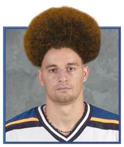
Like the Canucks, the Sabres would find that their old designs bring back a lot of nostalgia and positive reviews. When the St. Louis Blues changed to a more classic design a few years (away from those clown uniforms), it was one of the best things they could have done. Perhaps the CALGARY FLAMES could take a cue and wear uniforms that aren't so hard on the eyes. Black letters on red? Ouch!
Comments:
<< Home
Uniforms that aren't so what the eyes? Heh.
The Caps home (black) unis are similarly difficult to read from afar.
The Caps home (black) unis are similarly difficult to read from afar.
Never seen a sweater looking busy
before lol.
Everything retro is popular here now,reminds me of the ugly brown
wallpapers with medallions everyone here had back then,yuck.
before lol.
Everything retro is popular here now,reminds me of the ugly brown
wallpapers with medallions everyone here had back then,yuck.
Jes, I suggest you view the OTHER sweater design they'll be wearing next season.
http://www.mikechenwriting.com/blog/pivot/entry.php?id=187
It's like that Paula Abdul song...two steps forward, two steps back.
http://www.mikechenwriting.com/blog/pivot/entry.php?id=187
It's like that Paula Abdul song...two steps forward, two steps back.
I believe this is the look of the new sweater.
http://i34.photobucket.com/albums/d133/bergmanrocks/sabresjersey.jpg
If this is the sweater and not some pre-design, I'd be dissapointed.
http://i34.photobucket.com/albums/d133/bergmanrocks/sabresjersey.jpg
If this is the sweater and not some pre-design, I'd be dissapointed.
I watched the presser over on the Sabres website, and he kept saying that the image that was leaked on the internet is basically it, but that there would be more to it. He mentioned specifically that there would be swords on the sweater, and that there would be "words".
Post a Comment
<< Home


